
What Is a Marketing Deck? Tips, Examples, and Templates
One of the frustrating things about marketing a brand or business is capturing your target audience’s attention.
Potential partners and customers are busy folks, and it can be a challenge to share your brand story and business model in a short amount of time. This is where a marketing deck enters the picture.
Whether your business is new to the scene or around for decades, a solid marketing deck plays a crucial role in getting your company off the ground. It can mean the difference between booming sales figures and a lagging product launch.
What is a marketing deck exactly? What does a great marketing deck look like? Most of all, why should brands care about creating a well-designed deck for marketing?
Get answers to these questions and discover marketing deck examples and templates that you can use every time you’re about to design a pitch deck for your marketing efforts.
Let’s get started!
What is a marketing deck?
A marketing deck, also known as a pitch deck, is a visual marketing presentation of your product or service. It aims to educate potential investors, co-founders, partners, and customers about your product or service.
Marketing decks can have different purposes both internal and external. For example, marketers and advertising teams use certain decks for internal presentations. These are often referred to as snapshot decks and can include metrics and data for a specific period. Website traffic and foot traffic to a retail store are good examples of snapshot decks.
Meanwhile, the terms marketing deck and sales deck can be used interchangeably because, in some cases, the purpose of a marketing deck is to close a sale when you’re making a sales pitch.
An effective marketing pitch deck should be easy to understand, convey trustworthiness, and be persuasive enough to elicit FOMO from your audience.
What are marketing decks for?
The primary purpose of a marketing deck is to persuade your target audience about the value of your product, service, or business idea. Ideally, your audience should be able to recognize the need to support, purchase, or advocate for your brand after viewing it.
It’s also worth noting that marketing decks don’t have to be associated with startups alone. Businesses of all shapes and sizes can use them as a powerful, persuasive tool, whether online or in face-to-face presentations.
You’re not aiming for a fancy talk or a highly detailed presentation when presenting this type of deck. The best decks present lean yet relevant information to their target audience concisely and straightforwardly.
When you present your marketing deck, your audience expects the following information:
- Overview of your product or service
- Your target market
- The problem you’re solving
- How your product or service can specifically address the problem
- Your pricing
- Current traction (in stats)
- Business goals and how your team intends to accomplish these goals
- What makes you different from the competition
Finally, marketing decks are usually created using PowerPoint, Google Slides, and other presentation software tools.
Why is a marketing deck important for your business?
Regardless of your niche, size, and industry, a marketing deck offers the following benefits:
- The information you provide helps potential investors and partners decide if they want to take the next step (usually a meeting) in investing in your business.
- It also helps explain what your business does to prospective employees, customers, and clients.
- It’s a living document that you can change and modify as your business needs and goals evolve.
To sum up, a well-thought-out marketing deck is a solid business asset for organizations looking to grow, whether through securing more funding or acquiring more customers and partners.
The essential components of a marketing deck
Getting your marketing deck right can make or break your business. For this reason, you need to understand the essential components of an effective one.
Below is each component in detail with sample slides from popular marketing deck designs to inspire you the next time you’re about to pitch your business.
1. Overview of your company
The first component in your marketing deck presentation should introduce your company, product, or service in one sentence. It’s also important to state your unique value proposition (UVP) in this slide. Think of it as your power statement, and it should answer, “Who are you, and why should we listen to you?”
For this slide, don’t forget to include your logo, phone number, and email address. The presentation below from Manpacks is a good example of an overview deck. Manpacks bagged a good round of funding using this presentation.
 Source: SlideShare
2. Information about your target market
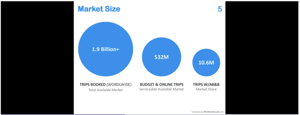
This component should include your audience’s demographics, market size, and market opportunity to succeed in the space. You can also highlight market validation or the process of figuring out if there’s truly a need for your product or service.
Take a look at Airbnb’s marketing size and market validation slides when they were just starting.
 Source: SlideShare
3. The problem
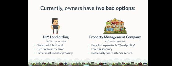
The third component highlights the actual problem that your product or service will address. In the sample slide below, Castle, a real-estate startup, raised $270,000 using this marketing deck.
 Source: SlideShare
This slide should answer the following questions:
- What are you trying to address?
- Who are the people experiencing the problem?
- What is the problem’s impact on the people experiencing it?
- How does the person address the problem right now, and are these solutions helping them?
If you can’t show you’re solving a real problem or pain point, your audience might lose interest in your presentation. A good practice when presenting a problem is to share a story.
You can further capture your audience’s attention by using visuals to explain complex issues. Finally, it also helps if you can illustrate how serious the problem is through data.
4. The solution (your product or service)
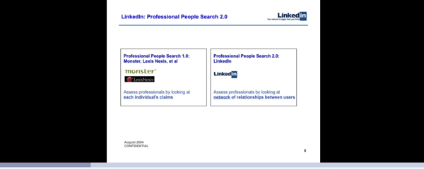
After sharing the problem you’re solving and the corresponding market opportunity, your next step is to spotlight your solution! Paint a picture of your unique value proposition and support it with relatable anecdotes and visuals like video clips, photographs, or even a physical demo of your product.
At this point, don’t get too caught up in describing your solution in detail. Instead, provide a higher-level overview of your solution. Here’s how LinkedIn did it back in 2004.
 Source: SlideShare
5. Traction
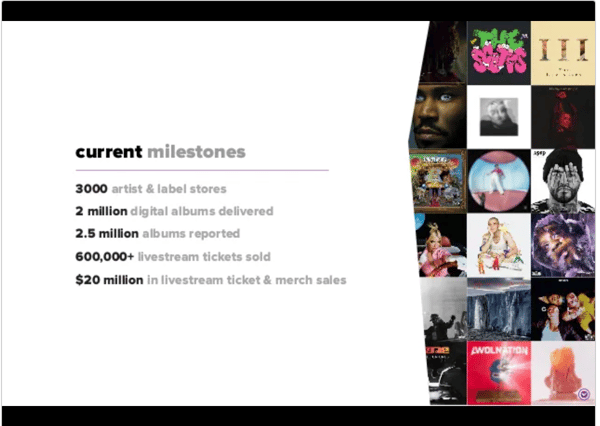
This component will help validate whether or not your business model works. Focus on numbers that have contributed to your growth, like month-to-month sales figures, the number of app downloads, or your profit margins. The goal is to reduce any fear of risk in potential investors.
Take it from Single Music, a platform that allows artists to monetize their Spotify profiles.
 Source: Single Music
6. Information about your competitors
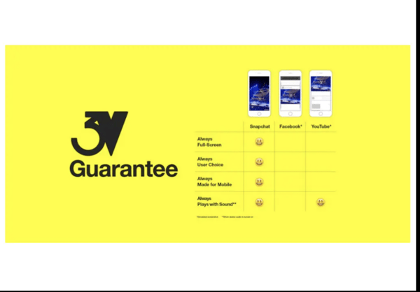
For this slide, list your competitors and how your product or service compares to them.
Pro tip: Always highlight your company’s unique competitive advantages over your competition. However, avoid belittling your competitors.
Look how Snapchat compares itself to other platforms in terms of advertising in this slide.
 Source: SlideShare
7. Your marketing strategy
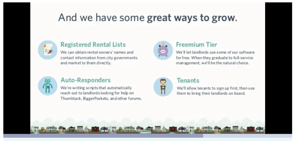
After convincing your audience about the problem, the solution, and how your product or service is different from the competition, your next slide should answer the question – how will you market your solution, and how long will it take?
 Source: SlideShare
This section of your marketing deck should answer:
- How will you market to prospective customers?
- What kind of marketing assets are you going to create?
- What methods and means will you use to reach your customers? Why do you think they will work? Provide any proof you have that this can be achieved.
- What’s your pricing like?
- What are your target conversion rates?
You should be able to answer questions about your marketing funnel when presenting this slide.
8. Financial information
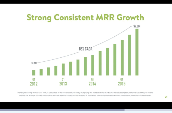
A slide highlighting your financial forecast is one of the most crucial components of your marketing deck.
 Source: Pitch Deck Hunt
Show your audience that you and your team can make money from your product or service. After all, investors and partners want to know if you can grow the funds they’ll invest in you.
Meanwhile, if your marketing deck is specifically for clients and customers, focus on how your product or service can help them save money in the long run.
9. Information about your team
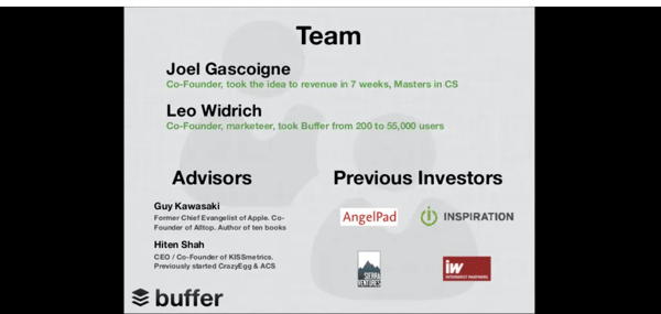
For this section, highlight your core team members’ domain expertise, skills, and success. Business partners and investors aren’t just investing in your business; they’re also putting their trust in you and your team. You need to show them that the people behind the product or service are capable, sensible, and trustworthy.
 Source: SlideShare
10. Social proof
One better way to inspire investors or customers’ confidence is to let them know that other people like them trust you.
For this slide, show off the positive reviews and feedback you’ve received in media publications, social media, and review sites like G2. Bonus points if you can include feedback from recognizable brands and influencers in your niche.
 Source: SlideShare
11. Your contact information
Finally, add your contact details (again!) to the final slide in your marketing deck. You can show this slide while answering your audience’s questions about your presentation.
 Source: SlideShare
How to build a marketing deck that works
Now that you already know the essential components to include, here are some helpful best practices for creating and designing powerful marketing decks.
1. Know your audience or investors
The better you know your audience, the more likely you’ll tell a story or share information that truly resonates with them. For example, find out what kind of businesses they support and learn about their best practices. Learning more about your target audience is the first big step toward a great pitch deck.
2. Use easy-to-read fonts
Your deck should be easy to read and understand. Always use simple and legible fonts. The best fonts for presentations are bold and big enough to make them stand out from the rest of your text. However, don’t overuse strong fonts. Glaring fronts hurt readability and aren’t a good sight for sore eyes.
3. Ensure that every slide in your deck has a purpose
When creating a deck, you should know where you’re heading. Each slide should answer:
- What is the biggest takeaway?
- Does this content convey what we want to say?
An aimless presentation serves no good cause and is confusing for both your team and audience. When you know what you intend to convey with your slides, your audience also understands what to take home from it. You need to bring out the unique value with a defined purpose.
4. Consider brand consistency
Your marketing deck presentation is like your brand ambassador. Your audience might take photos or screenshots of your slides to share or save for reference.
Make sure the font, color schemes, and format of each slide in your presentation are consistent so that it’s used as an example, not discarded as another convoluted graphic. Pitch decks with multiple fonts, color schemes, and backgrounds can often look amateurish and make you appear less trustworthy.
5. Aim for simplicity
As with fonts, aim for simplicity throughout the deck. Avoid walls of texts or even bullet points (a common practice) in your slides when possible. Use images or keywords the audience can connect to while listening along.
Simplicity adds to the visual appeal, enhancing the overall customer experience. If your presentation is simple and naturally flowing, it gains more real estate and attracts a larger audience.
6. Tell a story
You have probably read about this best practice many times. It’s thrown around a lot because it rarely fails. Sharing a story keeps people interested in what you have to say and can also help make your presentation more compelling.
Regardless of the purpose, your decks should aim to create a brand story. It should answer the what, why, and how of your brand’s values and how they relate to your customers.
7. Use visuals
Our brains favor visuals over plain text. This isn’t just an observation, but a proven fact. Therefore, make an effort to use images, infographics, icons, graphs, and similar visual elements in your presentations.
Also, remember not to overdo the graphics. Only use relevant visuals, and don’t clutter your deck just because you think your audience will find them appealing. Too many visual or graphic elements can, in turn, impair readability and put the viewer off.
8. Always cite your facts
It’s always good to reference every claim or statistic in your deck to build credibility. All your sources should also be recent and up-to-date.
A best practice is to quote only relevant facts and figures essential to support your argument or solution. Find a way to link them to the proprietary or original source.
9. Break the rules
Lastly, don’t be afraid to break the rules!
For example, your research tells you because your audience loves to talk about growth strategies, you need to talk a lot more about traction than how your product works! With this information, feel free to spend more time highlighting growth tactics in your decks.
What’s more important is that your deck presentation flows smoothly.
Examples and templates of effective marketing decks
Here are a few examples of effective marketing decks and templates that you can use.
1. Zuora
Andy Raskin, a strategic narrative consultant, shares several reasons why this presentation from Zuora is the “greatest sales deck” he has seen.
Source: SlideShare
These reasons are:
- It talks about a significant, transformative change
- The winners and the losers of the change
- How Zuora can help its audience be part of the change
2. Buffer
Leo Widrich, the co-founder of Buffer, writes how this marketing deck helped them raise half a million dollars. He spoke about how traction is one of the most important elements of a pitch, particularly if you’re new to presenting your decks.
Source: Buffer
3. Velocity Partners
This deck by Velocity Partners, a B2B marketing agency, is a perfect example of a brand that isn’t afraid to break the rules.
Source: SlideShare
With 50 slides (the standard recommendation is to have 20 slides or less), this deck talks about the content marketing deluge and how brands can rise above the noise.
Marketing deck templates you can use
As a marketer, you have a lot on your plate. The good news is you don’t have to make decks from scratch. Here are three templates you can edit and use:
Know your audience first and make better marketing decks
Regardless of your niche or industry, creating better marketing decks boils down to getting to know your prospective audience as much as possible. The more you know and understand their needs, the more persuasive and engaging your deck will be.
You got this!
Struggling to create a presentation that’ll stand out? Explore presentation software to create interactive slide decks and get your message across.