
Website Personalization 101: How to Make Visitors Feel Valued
Give a little TLC to your brand audience.
Imagine you’re at a Japanese restaurant to try sushi for the first time. As you enter, your eyes meet a completely different sight. You imagined zen-like serenity, but got hammered with the ruckus of staff and customers.
Without wasting a second more, you storm out.
The place simply made you feel unwelcome. Similarly, if a customer encounters a poor user experience on your brand website, they will bounce and never come back. What retains their attention is website personalization.
Brands today use the power of personalization engines to segment consumer data and create tailored experiences that resonate with purchase intent. The idea is to help the buyer find a way to the right solution without losing the plot of what they need.
You might be wondering whether you need to be a coding ninja for website personalization. Let’s find out!
What is website personalization?
Website personalization is the process of creating targeted product experiences for consumers on a brand’s website. It’s a way to analyze consumer demographics, intent, and sample data to highlight their brand services in the best light. Diversity, equality, and inclusion are also key factors in website personalization.
Rather than showing a one-size-fits-all page to a visitor, you use available first-party (your own data) and third-party data (enriched from a trusted source) to make a page more relevant, responsive, and insightful for every landing visitor.
Website personalization is not just about what users see, but cumulative shifts in page layouts, additional content collaterals, and so much more. The impact of website personalization on your success of overall value proposition strategy and traffic goals is huge and measurable.
Important factors of website personalization
When we talk about a well-structured website, we refer to the harmonious relationship of several of its building blocks. Whether you’re designing a static landing page that is informational in nature or a multimedia product page that promotes your application, you need to factor in the following concepts:
- Graphic design: Through interactive images, infographics, page layouts, charts, or other kinds of design elements, you can contextualize your message, reduce cognitive load, and optimize the user experience.
- Content creation: Website content needs to be dynamic, concise, and relatable to the incoming visitor. While jargon content might give a relative traffic boost at times, it does create a questionable image of your brand in the long run.
- Call to action: Call to action elicits a visitor to take further action down the sales funnel. It is a golden lead generation and conversion tool that can bring direct organic sales growth from the website.
- SEO: SEO benchmarks the competitiveness, quality, and expertise of your product against high-performing domains in the search engine result page (SERP).
76%
Consumers said that receiving personalized communication was a key factor in prompting their consideration of a brand.
Source: McKinsey
Examples of website personalization
Ever since the internet sprang into existence, brands have been vying for a good online reputation. The struggle started from just having a basic HTML website to adding JSON, React.JS, XML, and PHP languages to their code to create responsive websites.
They also now use location details, product types, and prices that direct consumers to the nearest brick-and-mortar stores. With uncountable inventions in digital technology, networking, and social media, brands have come one step closer to their consumers.
Tip: Some brands take personalization a step further and include AR marketing on their websites. This technique helps individuals visualize the product in their surroundings, take a virtual demo, and then decide what to do.
Here are some more examples of website personalization that drives foot traffic to your website:
- Amazon: Amazon tracks users’ intent and uses it to create specific product landing pages. Right from their homepage, they analyze the whole journey of the visitor to evoke specific sales action.
- Bombfell: Bombfell conducts email marketing surveys to understand style preferences and how they vary based on type, size, and budget.
- Stitch fix: Similar to Bombfell, Stich Fix compares your suggestions based on random sampling and creates email and website stylebooks.
- Netflix: Netflix catches the trail of your current watches to suggest you movies, podcasts, and videos belonging to the same entertainment genre.
- Spotify: Spotify ensures that its content is tailored based on the audio you love, play frequently, or play occasionally. It also creates custom playlists, just like Netflix.
Creating a website personalization strategy
At first glance, website personalization can seem like a daunting subject to approach. There are simply so many possible experiments, audience segments, and data points at your disposal. Plus, most instances of personalization require some level of technical knowledge. Fret not!
We’ve found five quick and easy personalization instances that nearly any site can deploy. We’ll walk you through what they are, excellent examples of the techniques in action, and a few software tools you can use to help you launch these changes on your own site.
1. Personalize the content with the buyer’s persona
Start adjusting the content on your page for each unique visitor with a unique buyer persona. Let’s consider an example. On our homepage at Proof, when we don’t have information on a visitor’s industry, we display the following generic headline:
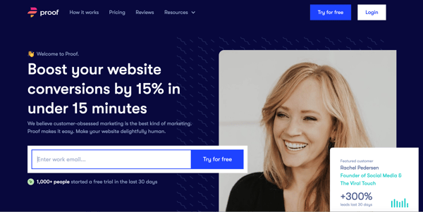
But if we’re able to identify a visitor’s industry, occupation, or other details (in this case, the industry is e-commerce) from their past behavior or responses on our site, we can customize content to suit their needs.
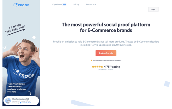
Buyer intent analysis is accomplished by getting visitor information off websites like Unbounce or engagebay with A/B testing.
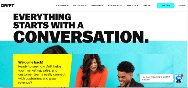
Drift, a digital marketing agency, also follows the exact same protocol. If you’re in the remarketing ad bucket and you click through to their site, you’ll see a landing page that describes how “Everything starts with a conversation.’
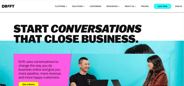
But if you’re in sales and see an online ad about Drift, you’re pushed to this page declaring Drift as “the secret weapon” for your sales and revenue teams:
2. Content recommendation
At its simplest, content recommendation is a system of suggesting relevant content to visitors who have already engaged with your website in some way. It is a form of native advertisement that suggests additional content along with existing content.
You might see content recommendations either in form of opt-in push notifications, top strips, or content widgets entitled “suggested reads” or “Users are also interested in”. It creates a fear of missing out on the visitor and compels them to keep reading.
Here’s an example of this tactic in play on the Salesforce blog where they use smart content to personalize the journey for their visitors:
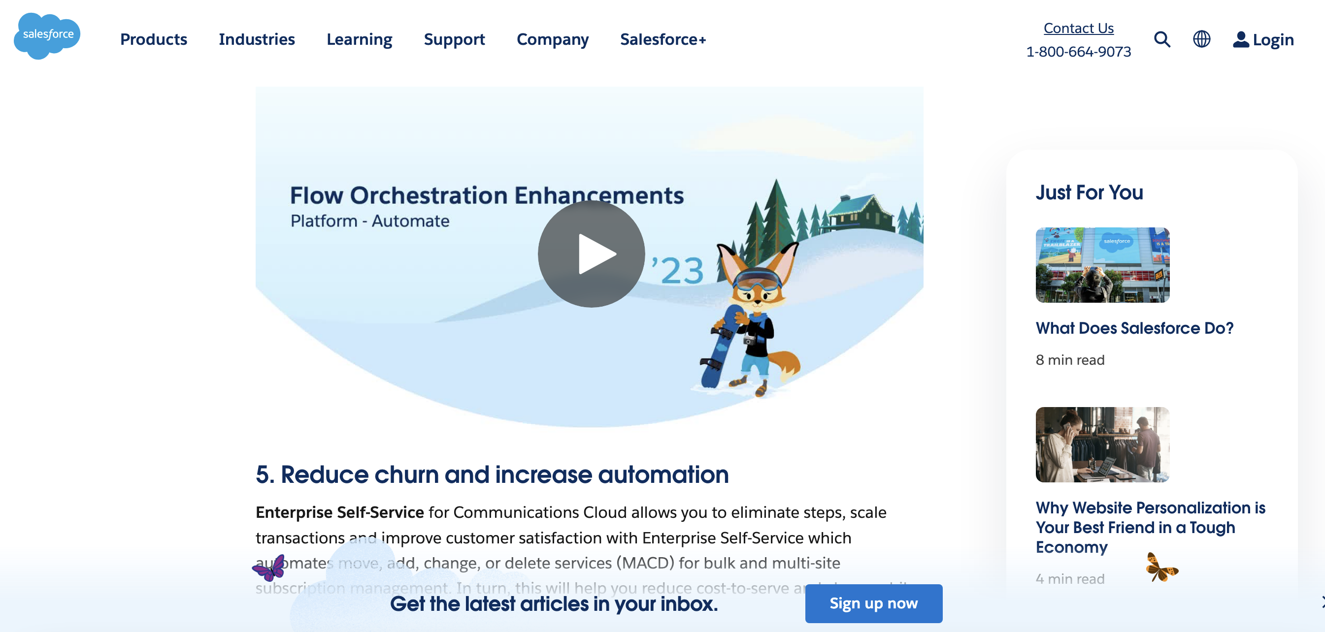
Source: Salesforce
Pique, an eCommerce site with a popular health blog, goes a step further to recommend personalized eBooks to visitors’ benefit.
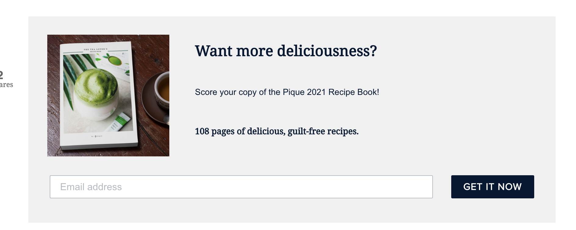
Source: Pique
The result? Readers see more relevant content — and the site sees visitors stay longer. Win-win!
To create a personalized website, you would have to granulate your customer outreach in a way that fetches the most insights. Here is what you need to collect:
- Location: The country, region, or state a user lives in.
- Technology: A user’s device type (desktop, laptop, mobile), operating system, browser, and screen solution,
- Traffic sources: Multi-level source attribution of traffic (direct, paid, PPC, organic, social)
- 3rd party data: Information collected from external surveys and BTL marketing.
- Behavior: Average time-on-page, dwell time, impression rate, bounce rate, CTR, engagement rate, and demo conversions.
- Explicit data: Data collected through internal surveys, webinars, or registration forms.
- Time slot: Time slot analysis of when the user is most active throughout the day, week, or month.
- Current page: Signals about what the user is currently checking in with respect to the sales lifecycle. It can be a URL, category page, or discount offers.
3. Change CTAs based on buying cycle
When a visitor comes to your site — you have an opportunity to create meaningful CTAs. Most popular content management systems, regardless of the sophistication of their data program, at least collect data regarding whether someone is a first-time visitor, a returning visitor, a lead, or a customer. Based on that data, the CTA is customized.
And many companies use an even more sophisticated lead-scoring method than that. At a basic level, most sites can create four different versions of a CTAs for these scenarios:
| First-time visitor | Welcome the visitor to your site, give an elevator pitch of your product |
| Returning visitor | Welcome them back to your site, and remind them about why they visited last |
| Lead nurturing | Nudge them gently to finish signing up or purchasing a specific order with content. |
| Customer | Delightfully welcome them back, upsell |
Let’s see an example of this in action.
A brilliant example of this is Gusto’s homepage. On the first visit to their site, you see the page below. The CTA header says “one place for payroll, benefits and so much more”.
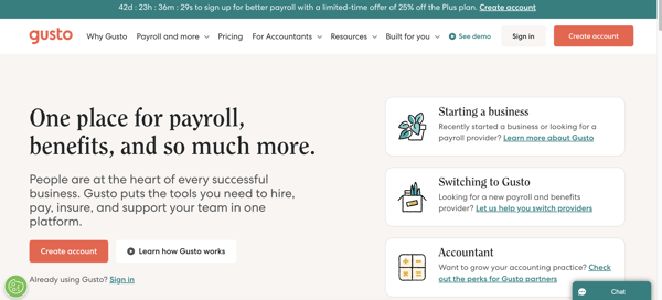
But if you’re a customer, Gusto knows it. Here’s the same homepage that this segment of visitors sees:
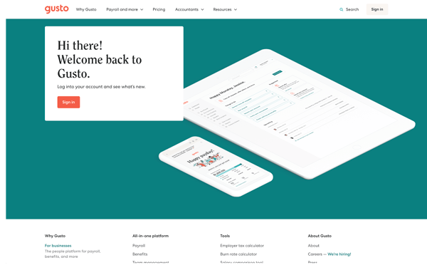
The first-time visitor and the customer see the same URL, but the experience comes across as far more relevant for each group.
4. Breadcrumbs navigation
A breadcrumb is a small text path, that a user traverses in order to reach a current page on your website. The user can navigate from the top of the funnel (ToFU) pages to the Middle of the Funnel (MoFU) to the bottom of the funnel (BoFu) page which is usually the payment window. Breadcrumb is a technical SEO aspect of website personalization that doesn’t let your visitor lose track of things.
Note it, google loves breadcrumbs. Other than XML sitemaps, it tells the crawler how have you systemized and structured your website for human understanding.
You can create different sorts of creative breadcrumbs to create memoirs for users.
- Hierarchy-based breadcrumbs: Home > Blog > Category > Post name
- Attribute-based breadcrumbs: Home > Product category > Gender > Size > Color
- History-based breadcrumbs: Home > Previous page > Previous page > Previous page > Current page
5. Header formatting
Your HTML headers on your website need to be succinct and sorted in decreasing order. For example, if your website’s main heading says “De-facto CRM to automate your manual process”, it doesn’t read too much into your product. Rather than having this header as H1, you can repurpose it to “De-facto Sales CRM to close deals faster”. This statement tells a visitor exactly where your product applies in the sales cycle.
Some tips to follow while designing headers:
- H1 or Main header: The first header of your website needs to be your main line of talk which creates a new vision for your product.
- Header hierarchy: Follow the lead of headers as you break into sub-topics of your headers. From H1, switch to H2, from H2 to H3, and so on.
- Soft colors and font: Use soft colors, that are pleasing to the eye. The most preferred font for headers is Serif or Sans-Serif.
- Primary CTA: Supplement your header with the main value proposition of your product. Your CTA should prompt the user to register an immediate interest.
- Mobile optimization: Ensure you format your headers for mobile websites. A huge chunk of the audience can view your website on the go. Flatten your UX across different gadgets.
6. Autofill forms with user data
The wildest concept of B2B marketing is that when someone wants to pay more money for your product (i.e. buy a high-tier or Enterprise plan), marketers often respond with more red tape: a barrage of questions required meetings, and many emails.
For example, if you say “I want to buy this software, here’s my credit card, I’ll pay anything” this is the response you get. “Ok great, can you fill out this form with 20 fields of information we already know about you, schedule a demo, talk with a qualifying rep for an hour, then we’ll the company decide if you’re a good fit.”
Consider Mention’s site. On their homepage, there’s a page that asks for your email to start the signup flow.
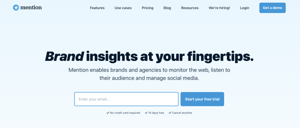
Mention keenly identifies this signup as an opportunity to delight their visitors by smartly identifying and validating data. As soon as you insert your email on the first page, they hit a database to pull demographic or firmographic data on you.
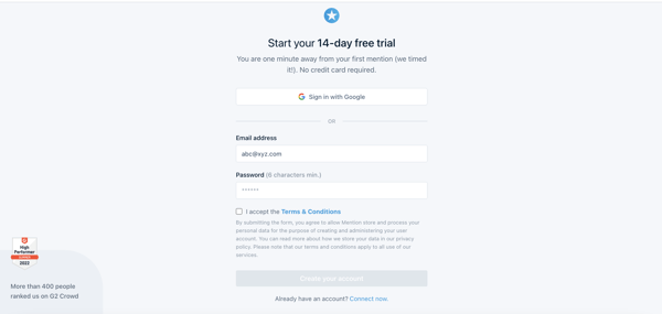
Then, on the next page, Mention auto-fills their form with information they’ve pulled about you. In the screenshot below, you’ll see that they pull your first name and last name from your provided email as well as carry your email from the first step. It creates a better experience for the consumer, and it acts as a gut check on a company’s data.
Website personalization engine
Taking different roads to the same destination of generating and nurturing MQLs is a multi-faceted process. Personalization requires connecting the dots between your brand and potential consumer through real-time segmentation, allocation, and analysis of their personal events, actions, and behavioral data.
Ingestion of this data from multiple sources can be centralized with a personalization engine, that aids in producing powerful, contextual experiences for consumers.
Earn that extra credit
Customers are, on the whole, happier when they get what they want. They view your brand more highly, and consequently, stay for a lifetime.
Personalization can be a frightening topic for brands. It can seem time-intensive, hard to manage, and technically complex. And while this used to be the case, it’s no longer an issue.
There are tons of strategies that brands can start implementing today to build more engaging sites, and we hope the ones here were enough to get the creative juices flowing for you.
Learn how you can increase your email conversions drastically by building a winning email strategy.